There are a wide variety of visuals populating the Network of Thrones site, including: linked graphs illustrating the relationships between characters, story lines, location, measuring the impact of each protagonist, and each of these analyses could focus on specific seasons of the show.
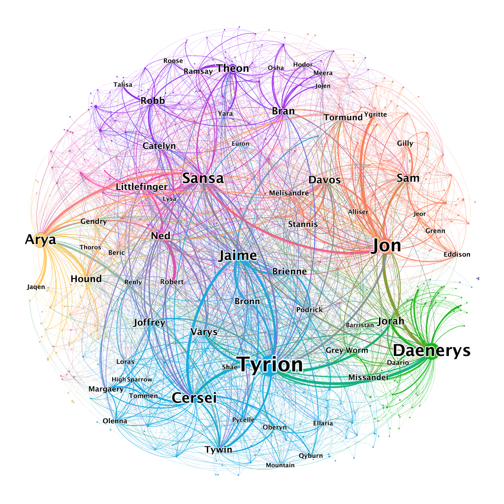
If we observe the first visual on their site (above), we are presented with an exhaustive account of the number and strength of relationships between the characters of the series. The nodes represent characters while the edges between them illustrate the strength of their relationship. Tyrion, a catalytic character in the series, is part of the Lannister house, so the strong edges connected to Jaime, Cersei, Tywin, and Joffrey are expected given their familial connection. For the fans who lasted later into the series, we know Tyrion has a strong connection to Daenerys as her advisor, so it makes sense that this is Tyrion’s strongest edge given how often they interact.
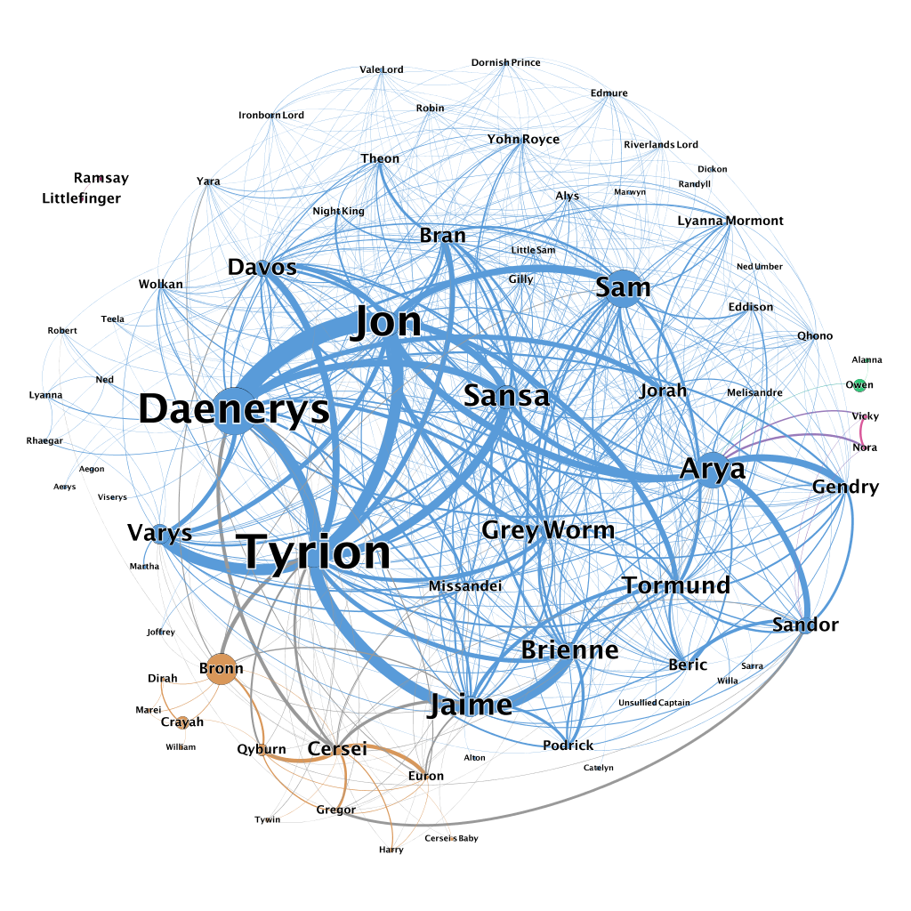
I think my favorite part of this project is the Seasonal visualizations because as a fan I can track the story lines as the plot develops between seasons. In the visualization above Daenerys, Jon, and Tyrion are evidently the most predominant, and if you watched the finale of the series, you know those characters dominated the screen. We can also observe the shift of power as previously dominant character fade into obscurity (cough* Cersei).
Moreover, there is some quite interesting algorithms behind the creation of these visualizations. Specifically, it monitored: two characters appearing together in the same location, two characters in conversation, one character talking about another character
one character listening to a third character talk about a second character, or a third character talking about two other characters, and so on. Each of these methods were weighted differently as some incidents would be more indicative of a relationship than another. Their chosen threshold for interaction was 15 words between each mention. Evidently, this led to a rather successful data visualization project.
-Liam Keane 1/24